Overview
Mongolia's gig economy was growing fast but operating invisibly. Workers found part-time jobs through word of mouth and scattered social posts. Employers made hiring decisions based on gut feel and personal networks. +emp was built to formalize this market, connecting workers with nearby opportunities and giving employers a structured way to find the right people.
Problem
Mongolian workers lacked accessible part-time job opportunities while employers struggled to find qualified candidates, creating market inefficiency and lost income on both sides.
Three things needed to change:
- Job discovery had to be location-aware and real-time
- The experience had to work for users with varying levels of digital literacy
- Contracts and agreements needed to be simple enough to complete in-app
Design Sprint
Before writing a single spec, we ran a 4-day design sprint to validate demand and align the team on direction.
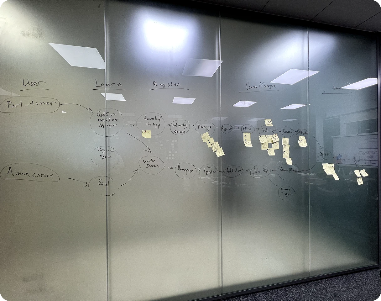
Day 1: Map & Target
We mapped the end-to-end user journey and established a long-term goal: become the biggest part-time job platform in Mongolia. The day ended with a clear picture of where the biggest problems lived.
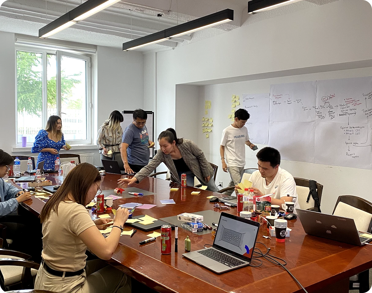
Day 2: Ideation
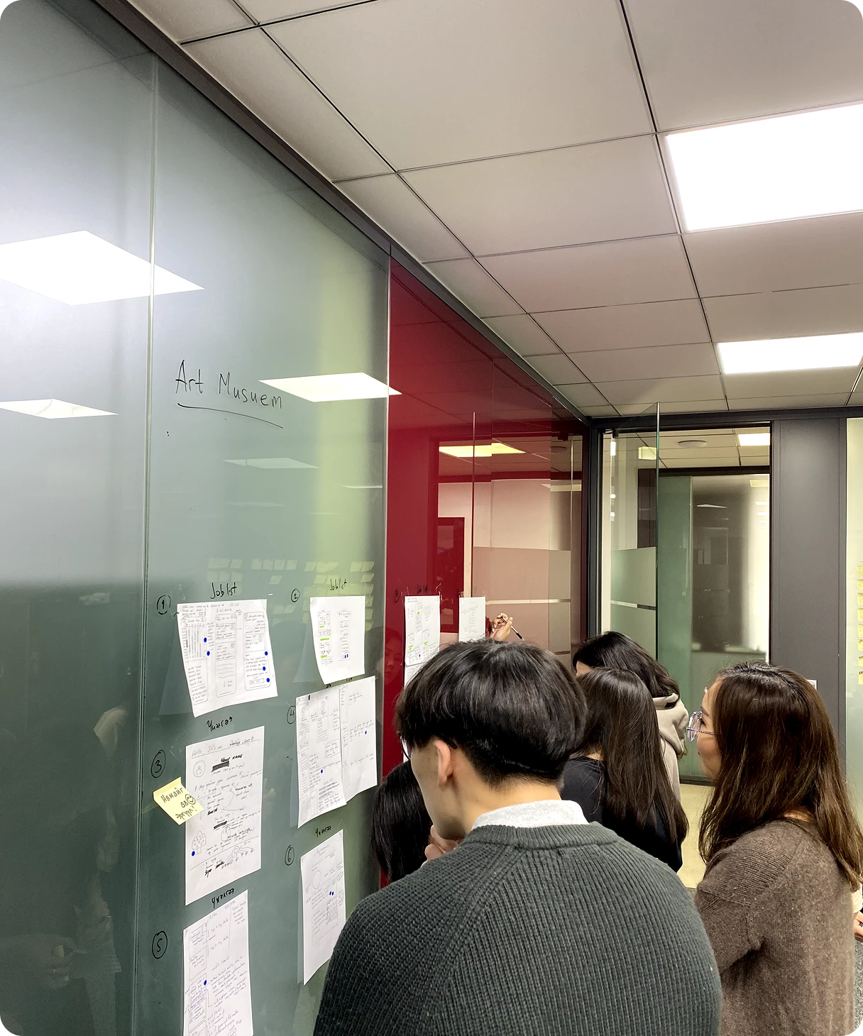
Art Museum. The team reviewed competitor products and analogous apps, looking for patterns worth borrowing and problems worth solving differently.
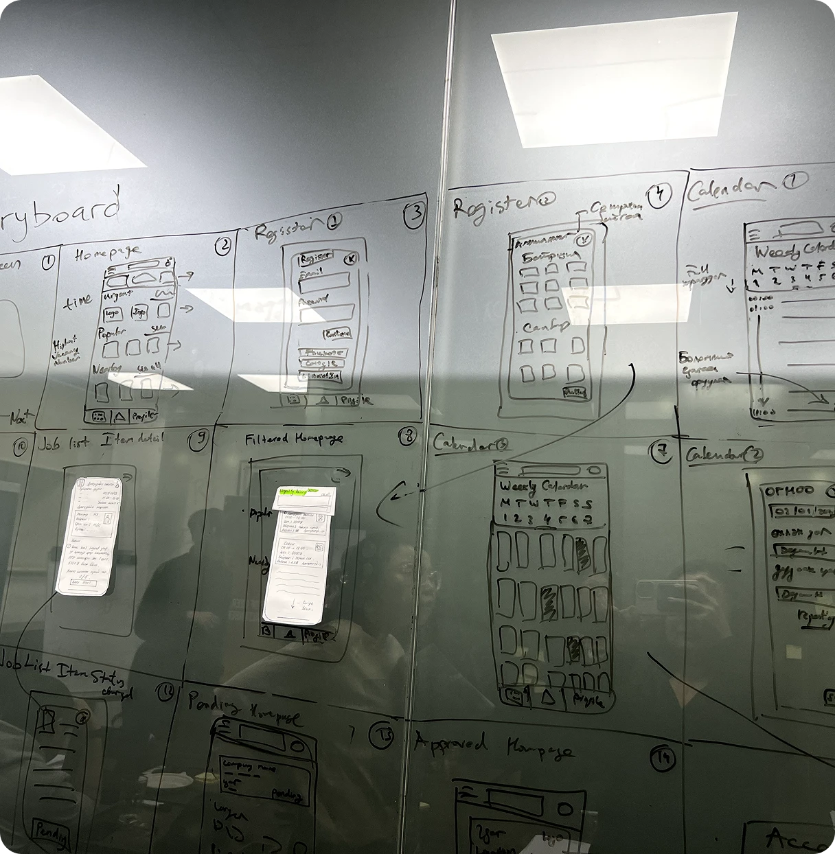
Storyboarding. We sketched the critical user path from first open to first paycheck.
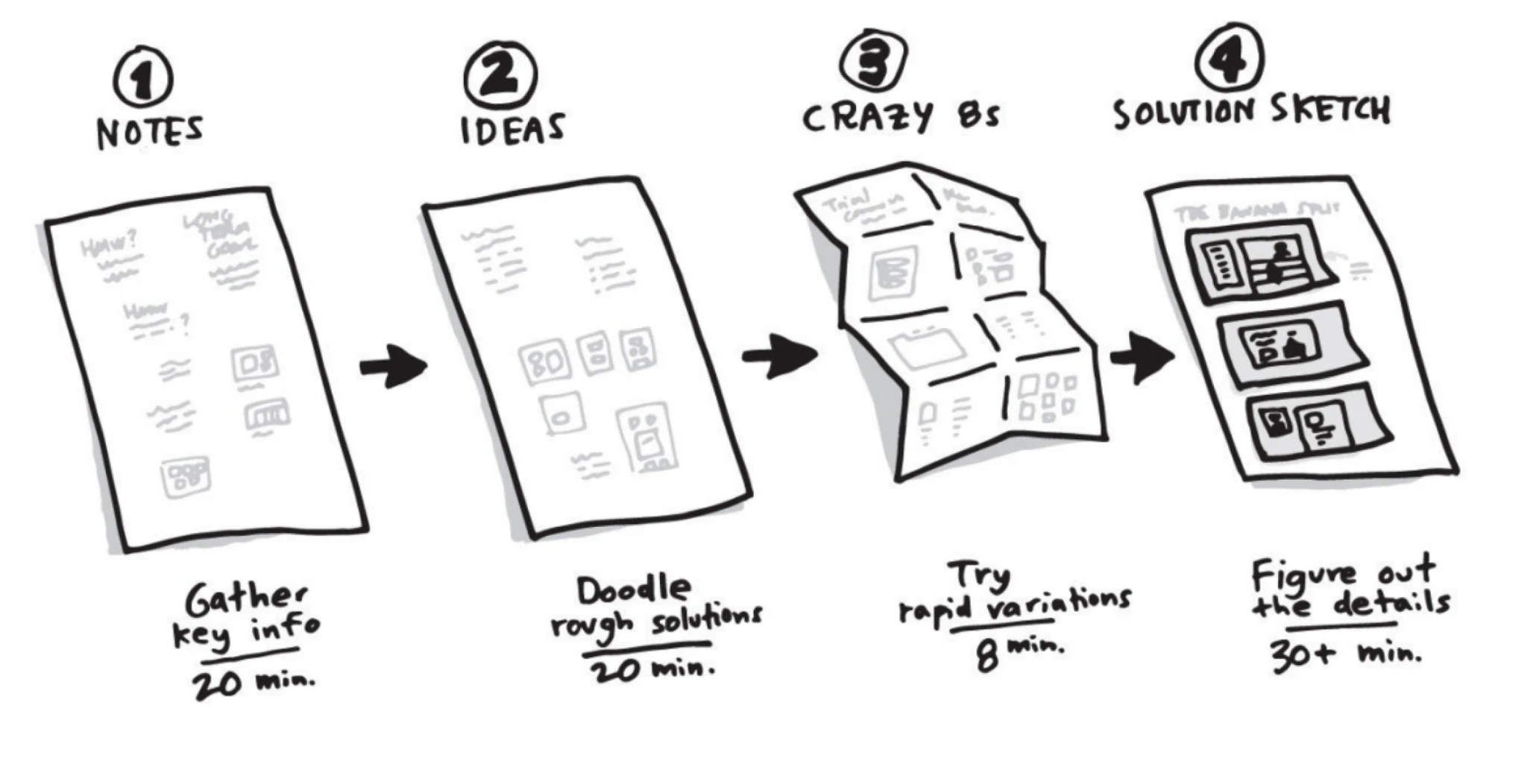
Four-Step Sketches. Each team member independently sketched their winning solution before the group voted.
Day 3: Prototype
We built a clickable prototype in a single day covering the core job discovery and application flow.
Day 4: User Testing
Four rounds of user testing with Mongolian gig workers across different age groups and work backgrounds.
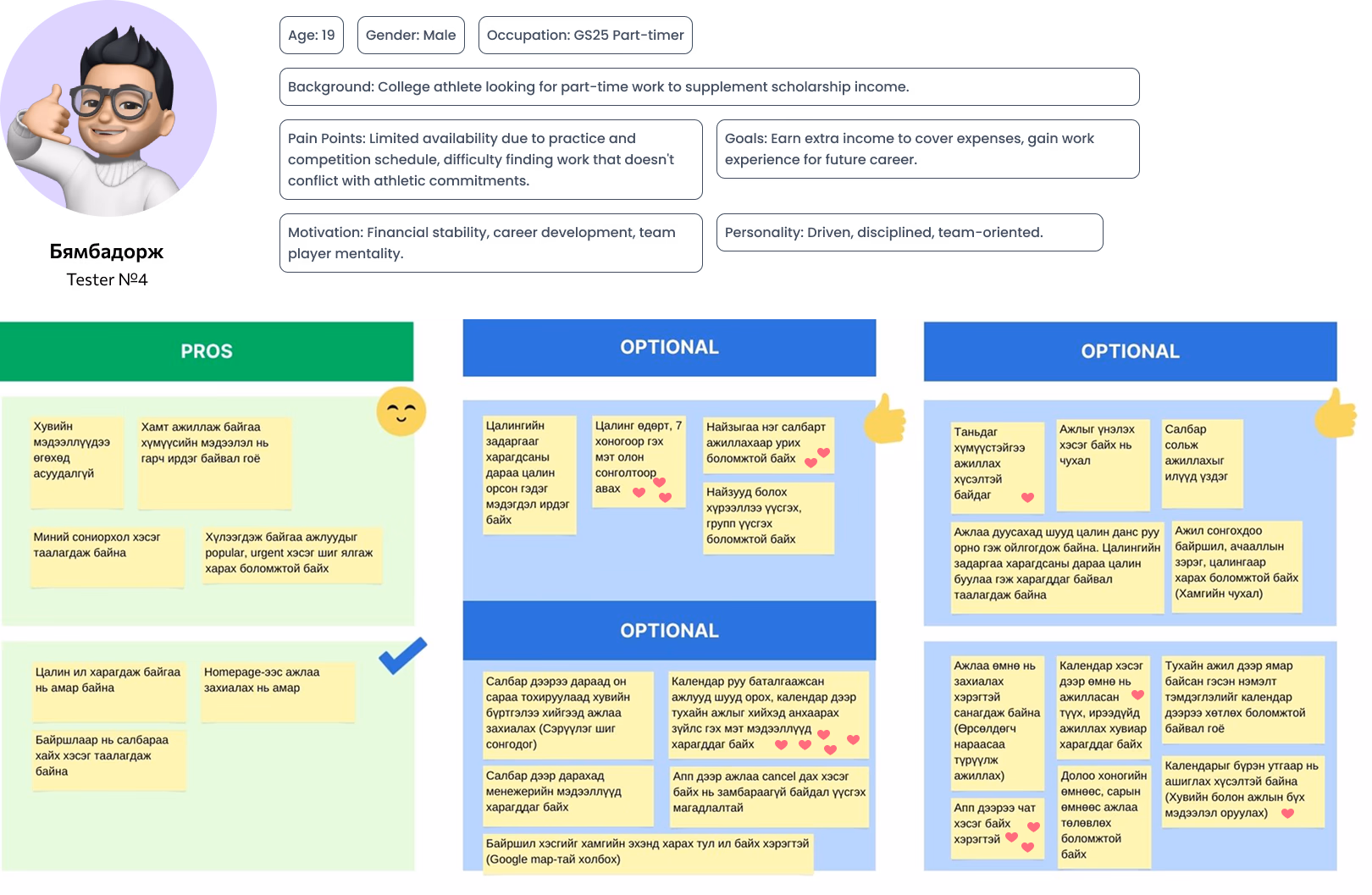
The sprint confirmed demand was real and the concept was feasible. We had a direction validated by actual users. Time to build.
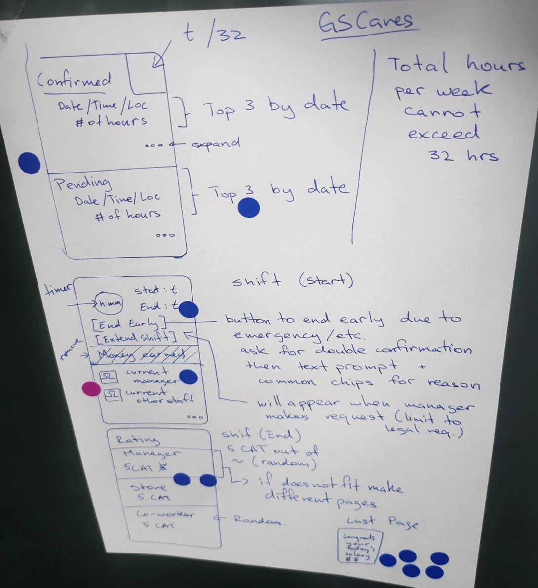
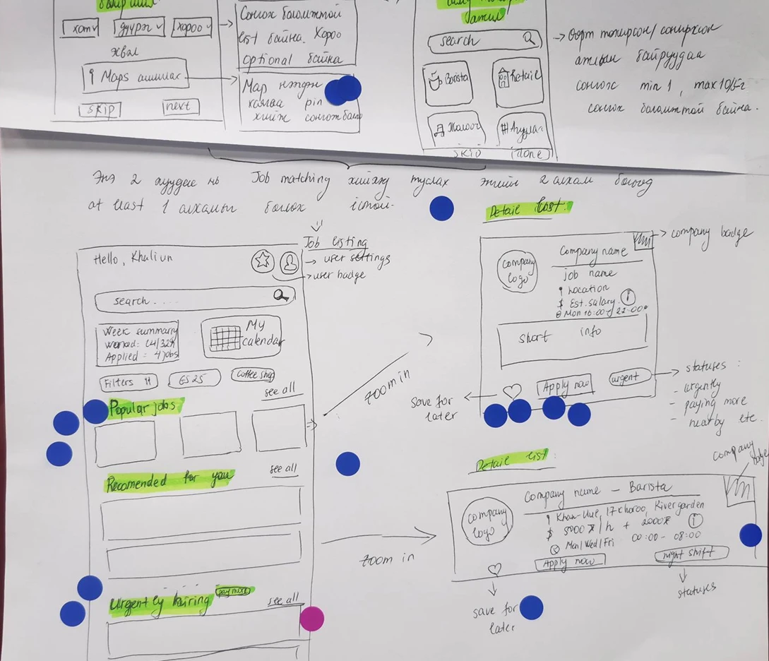
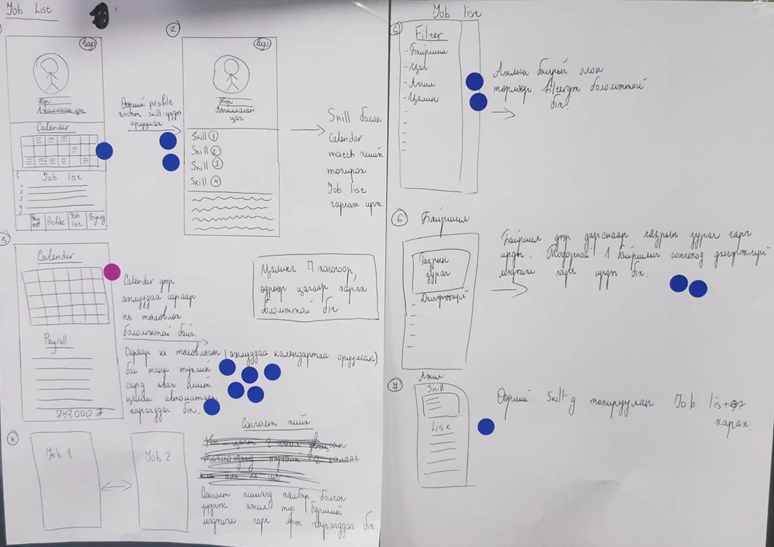
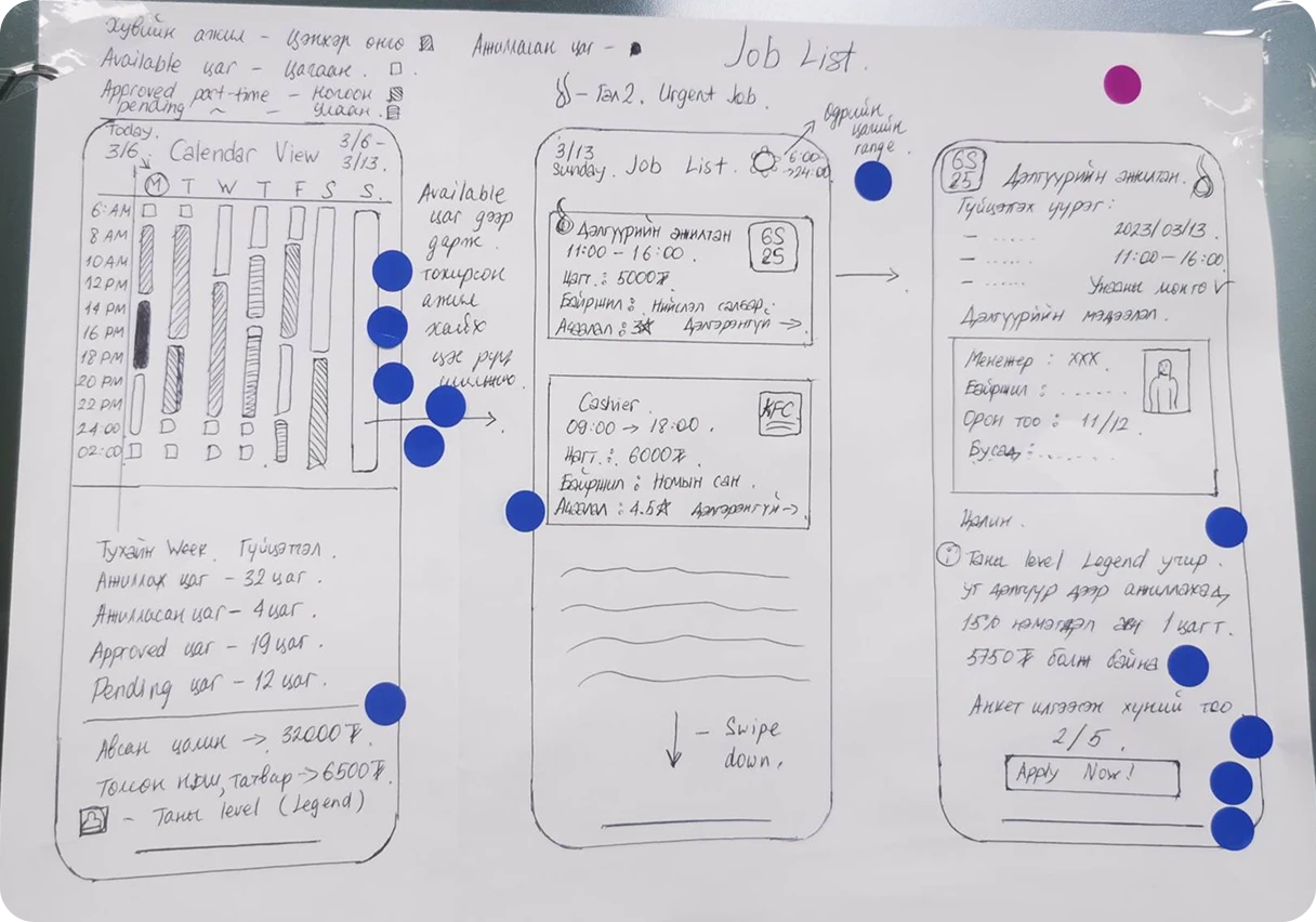
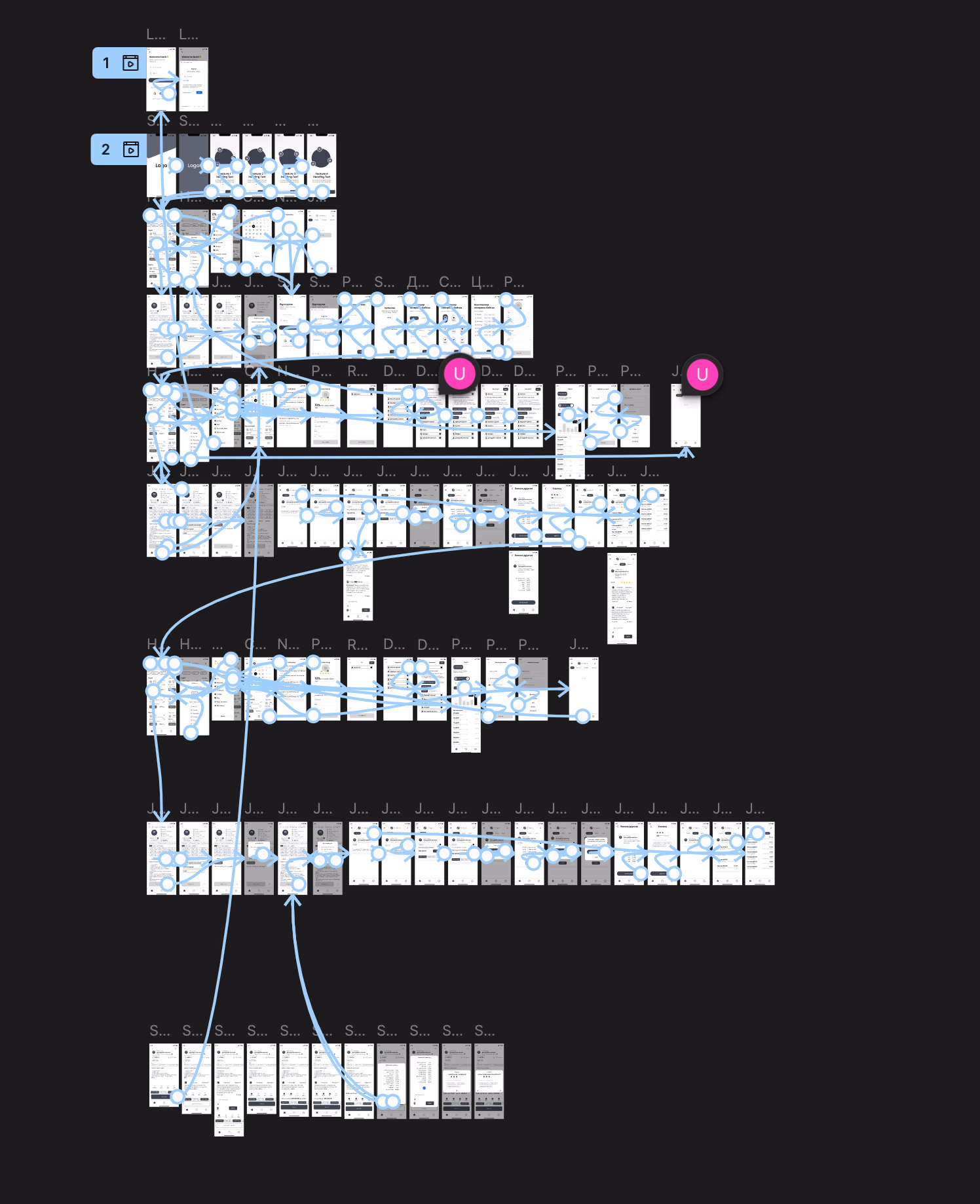
Low Fidelity Prototype
Sprint insights moved directly into low-fidelity wireframes, mapping the full user journey before committing to visual design.
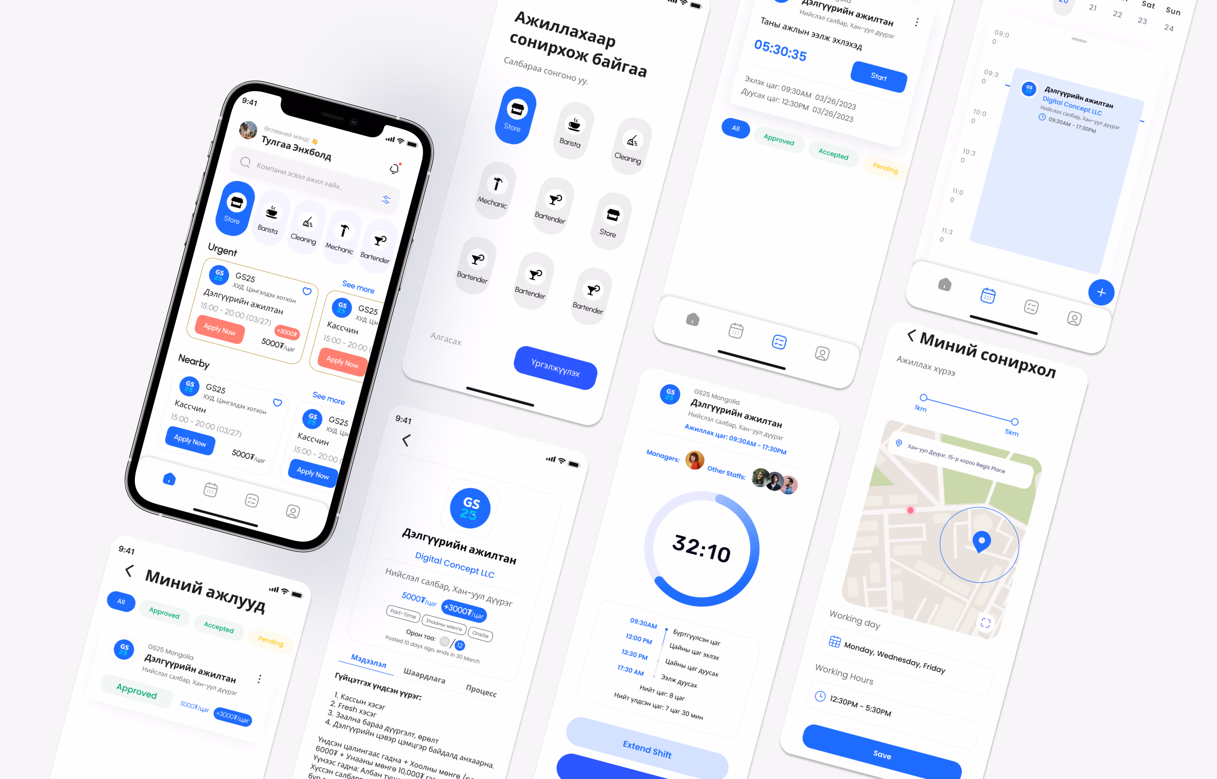
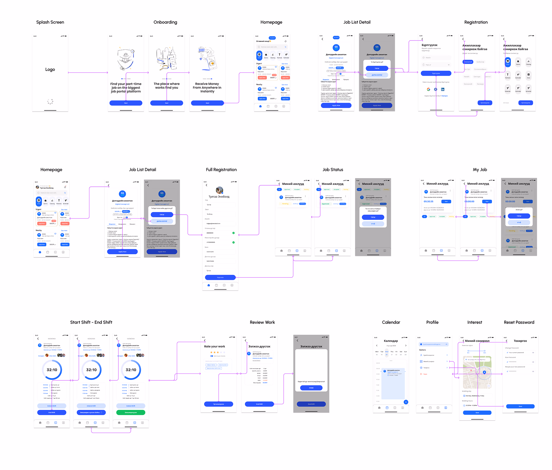
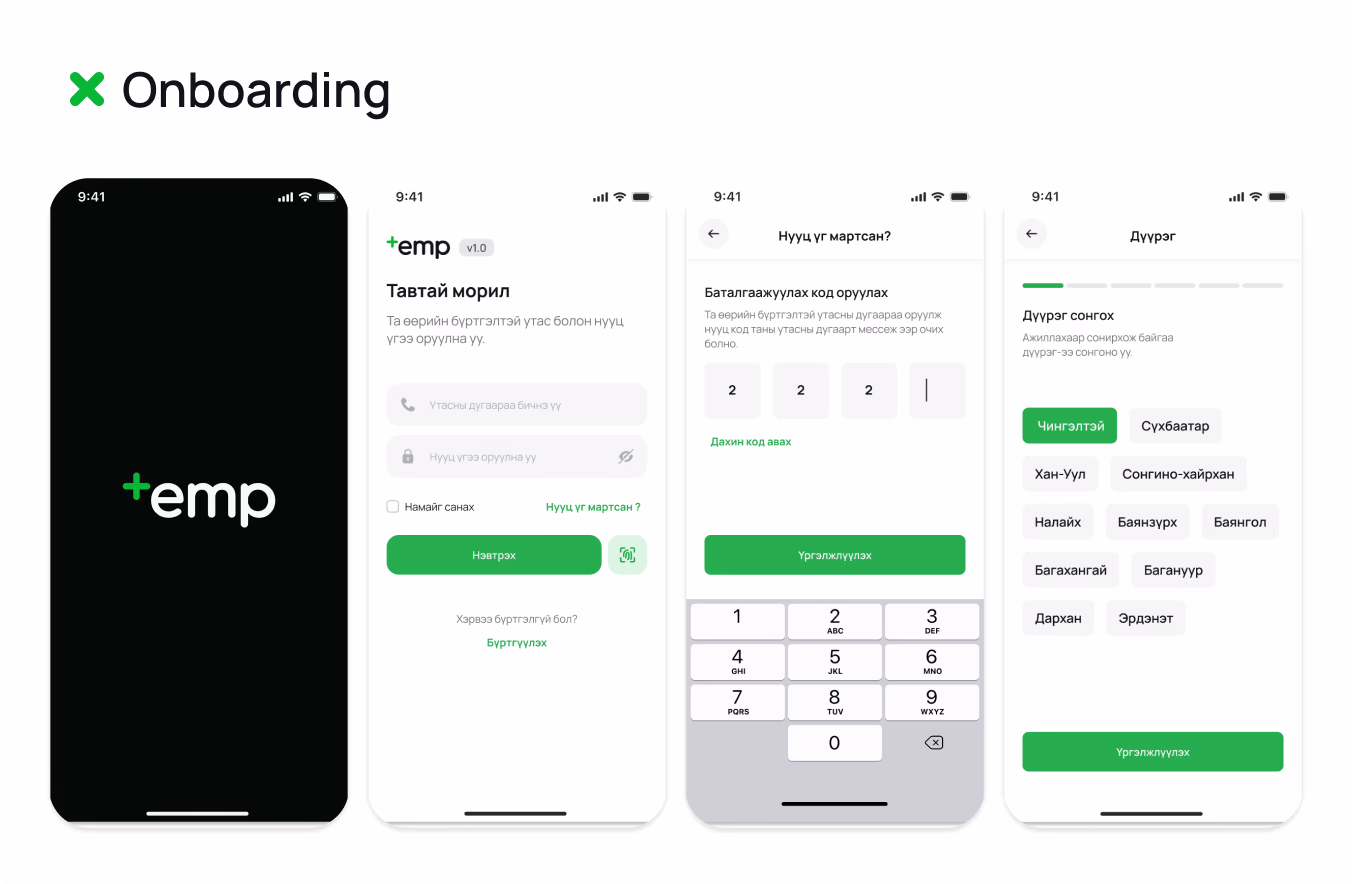
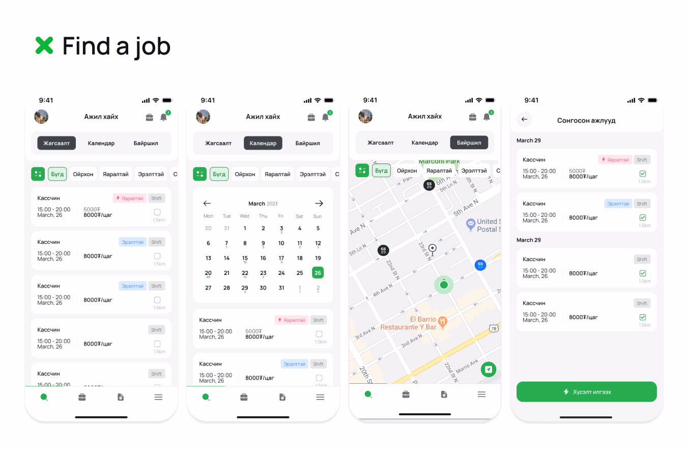
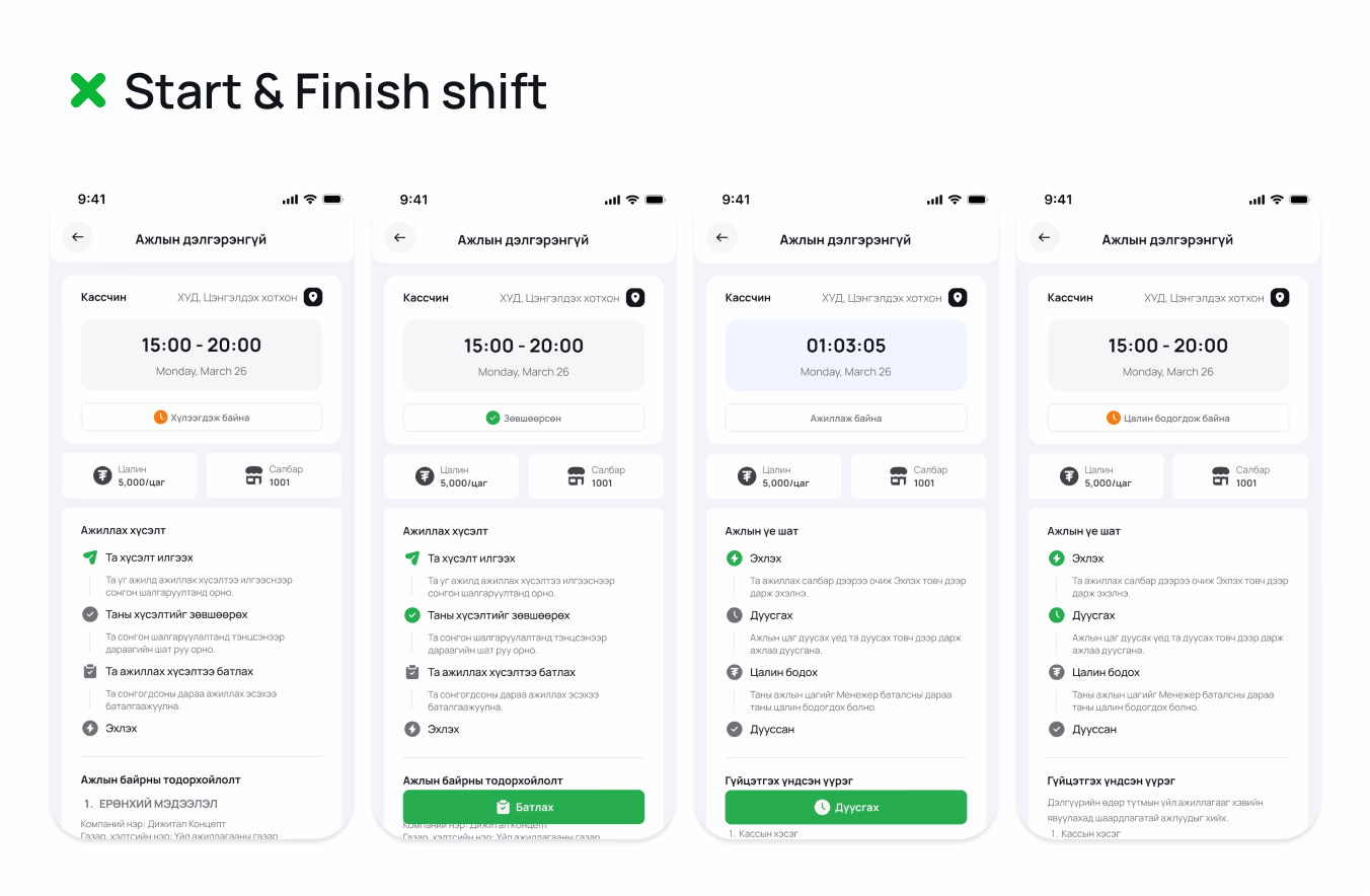
Design
With wireframes validated, we moved into high-fidelity design.
New Branding
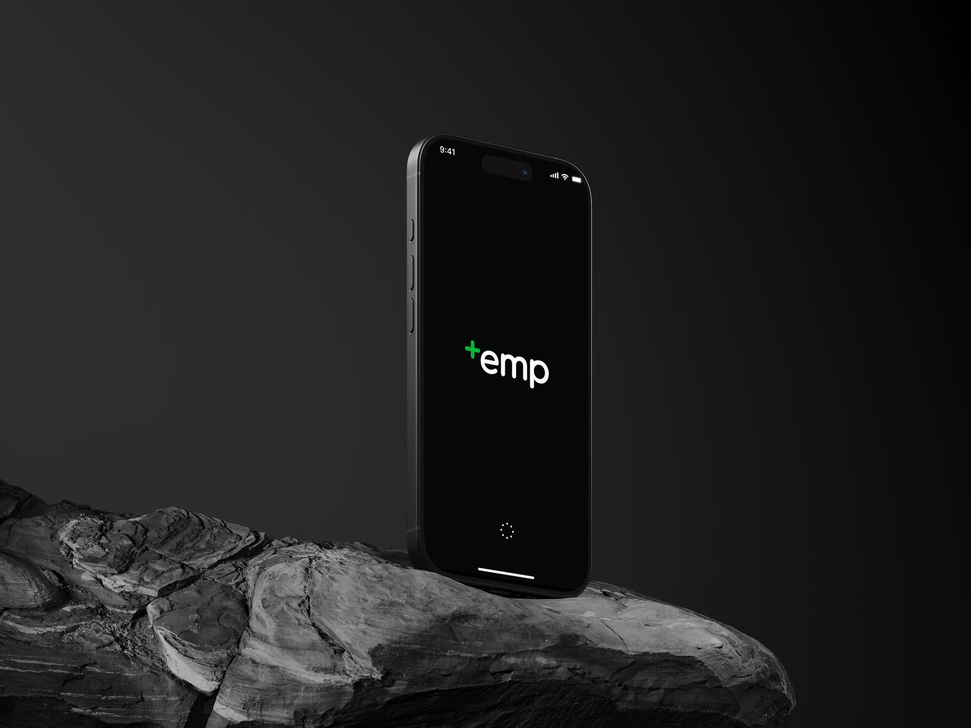
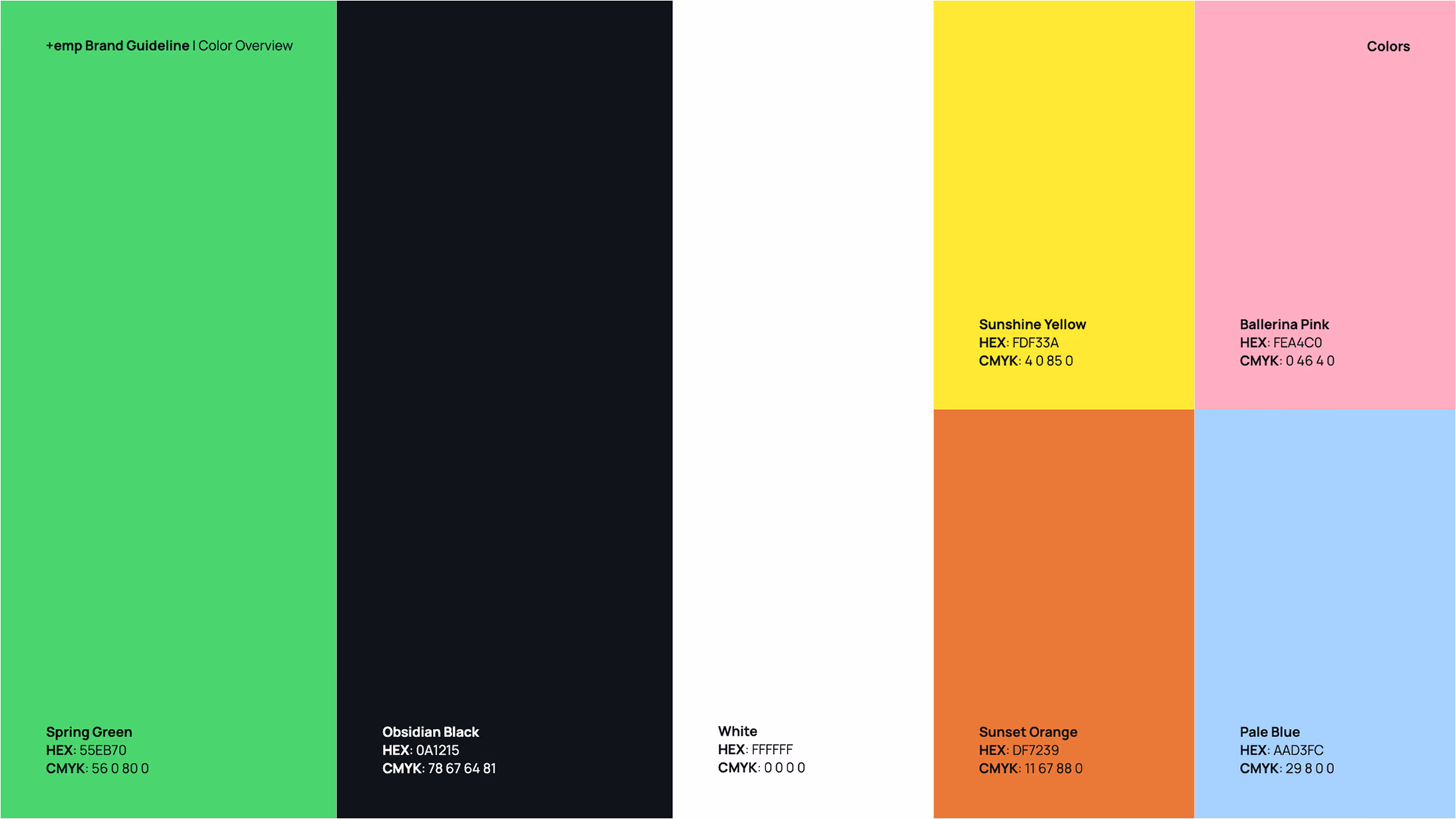
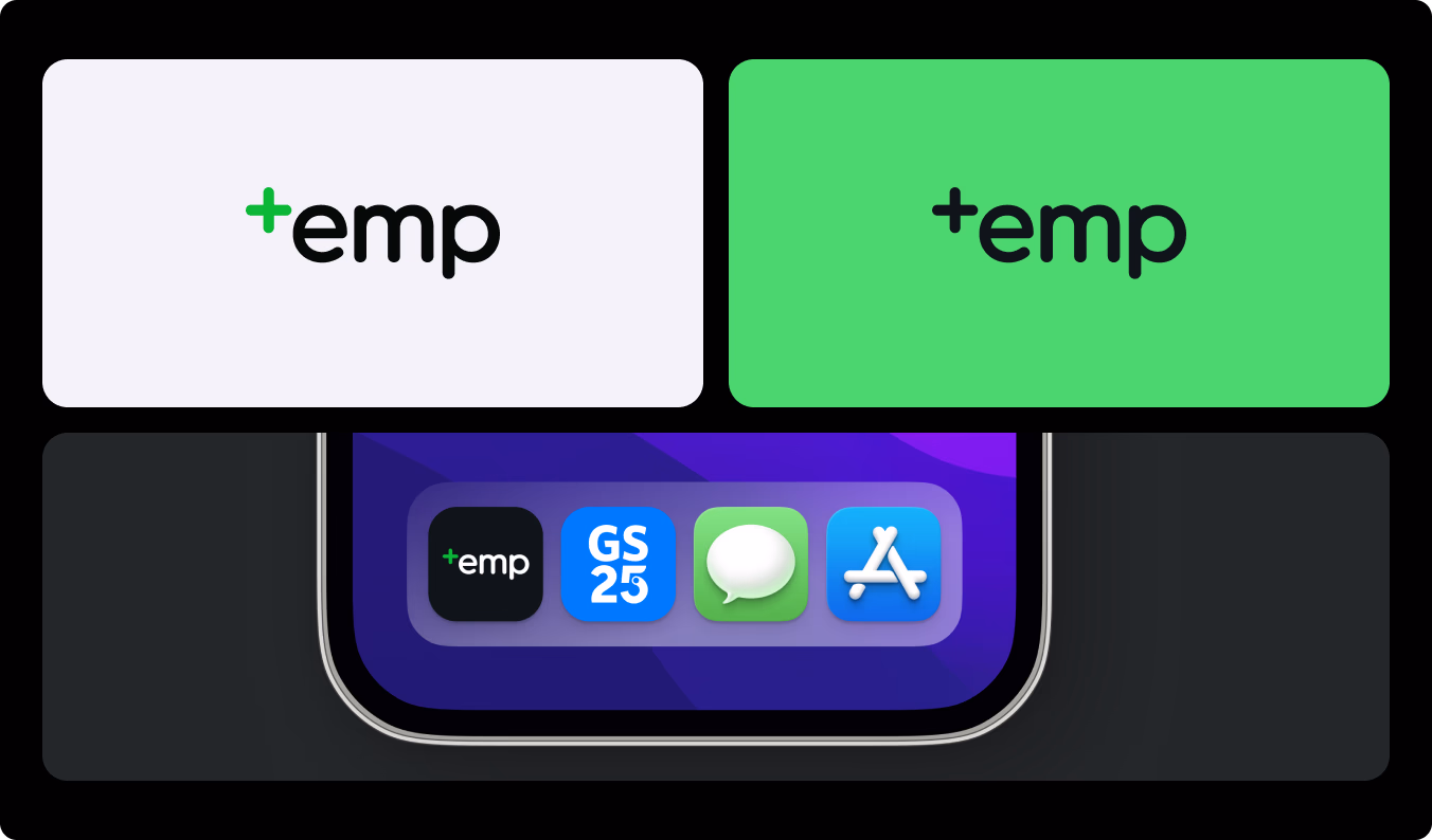
The client saw the designs and loved the direction, but asked for a rebrand. The original blue felt too corporate for a platform built around gig workers. We moved to a primary green with gold accents: warmer, more approachable, and visually distinct in the Mongolian app market. The name "+emp" represents empowerment and expanded possibilities.
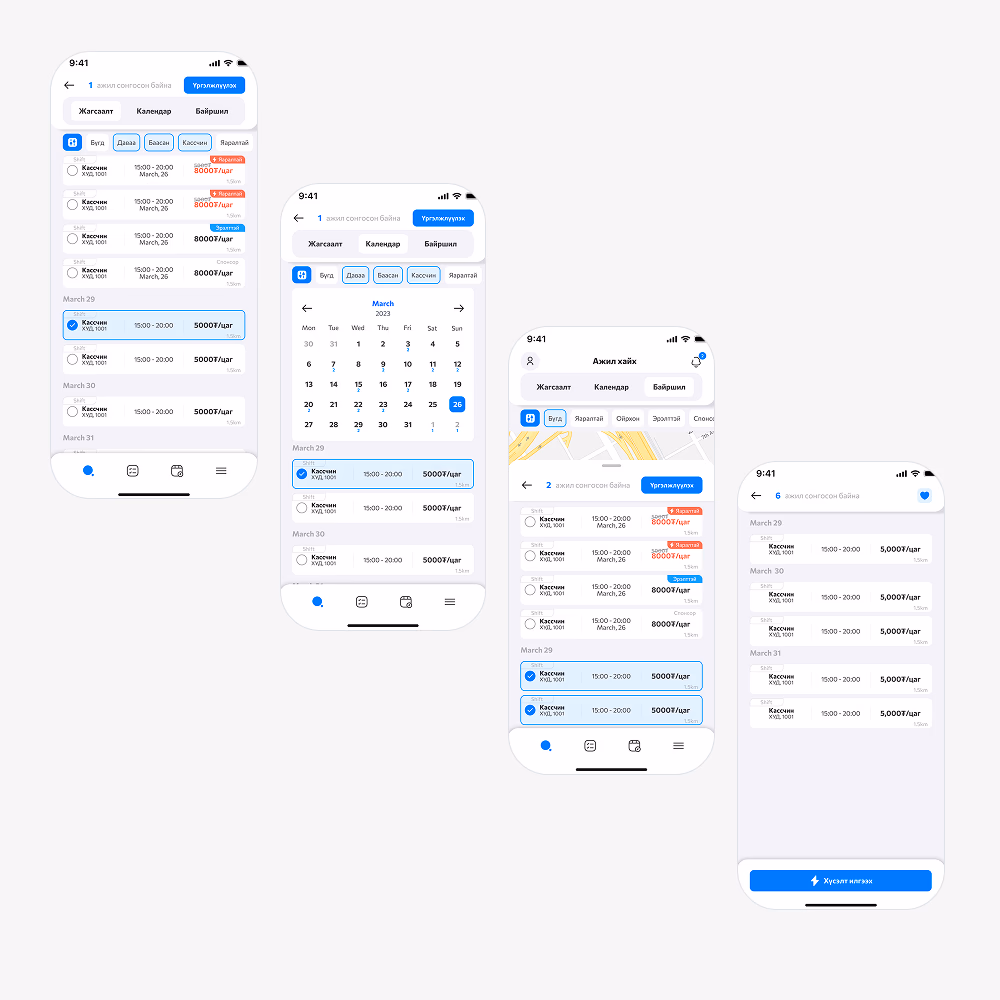
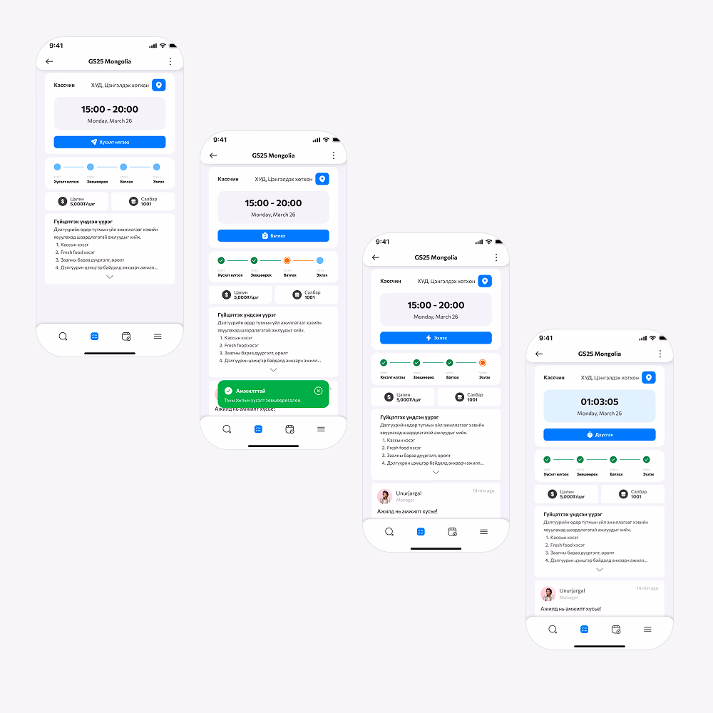
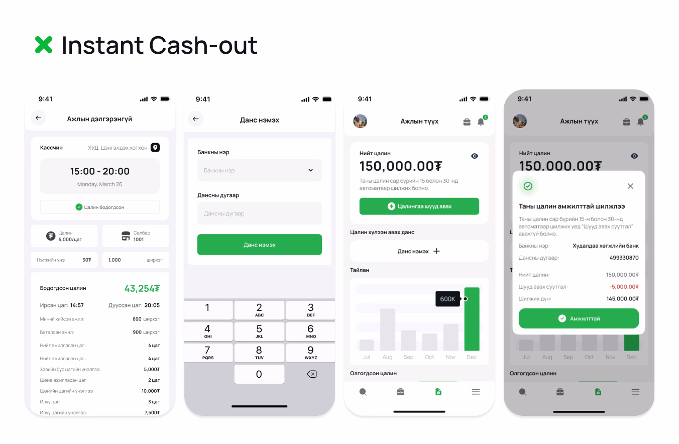
Key Flows
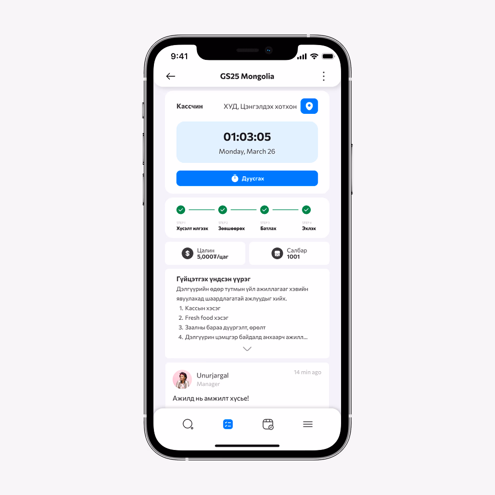
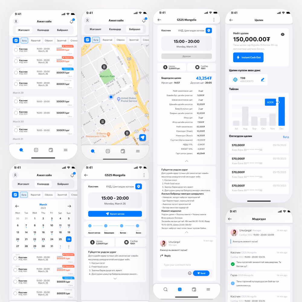
Final Product
Outcome
+emp launched with GS25 Mongolia as the first client. Within three months it had 2,000+ downloads and 300 part-time workers registered and ready to work. The platform cut out the manual back-and-forth that HR teams were spending to find and vet part-time staff, and gave people with free time a direct, structured path to earning through side gigs.
2,000+ Downloads
In the first three months since launch with GS25 Mongolia
300 Workers Ready
Part-time workers registered and ready to take shifts within three months
HR Time Saved
Replaced the manual process GS25's HR team used to find, vet, and onboard part-time staff